[01 - Projects]
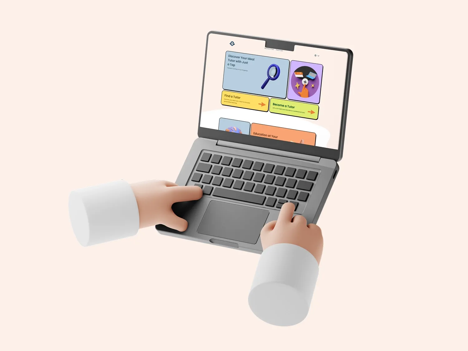
OneTapTutor
OneTapTutor set out to make online learning feel less complicated and more human by helping students and tutors connect quickly. The challenge was to design a platform that felt fast and approachable while still giving users confidence in the quality of each match.
We designed and developed a clear, conversion-aware experience that reduces decision friction, improves wayfinding, and supports both sides of the marketplace with practical, easy-to-follow flows.
Date published
Last updated
[02 — The Problem]
What needed attention
OneTapTutor needed a marketplace experience that could deliver fast student-tutor matching without sacrificing clarity, trust, or ease of use for first-time users.
- Users needed to understand how matching works quickly, without navigating dense or confusing flows.
- The interface had to feel friendly and lightweight while still signaling educational credibility.
- Both student and tutor journeys needed clear next actions to reduce drop-off during early interactions.
[03 — Overview]
The context
The core UX objective was simple: help users move from intent to action with minimal friction. We focused on information hierarchy, action clarity, and interface pacing so students and tutors can understand next steps immediately.
Because matching platforms depend on trust, we paired speed with clarity. Content structure, microcopy, and visual rhythm were shaped to make the product feel reliable, not rushed, while still preserving the one-tap value proposition.
The result is a learning platform experience that feels approachable and efficient, with stronger user confidence across discovery, matching, and early engagement.
[04 — Visual Direction]
How the work came together


[05 — What We Improved]
What we focused on
These were the main areas of focus in the work, based on what the project needed most.
[06 — What Improved]
What changed
OneTapTutor launched with clearer marketplace flows, stronger trust signals, and a more intuitive path from discovery to student-tutor connection.
[07 — Results]
What followed
- Faster perceived path from landing to matching action
- Clearer, trust-building UX for both students and tutors
- Stronger flow continuity across key conversion touchpoints
[08 — Get Started]
Want similar results?
Get a free website audit and see where your structure, messaging, and conversion flow can improve.
[09 — More Projects]